Client: Wolseley UK
Wolseley UK appointed The Team to help strengthen their longstanding vision. To be the first-choice specialist merchant for their trade customers and helping them to ‘achieve more’. A principle they have stood by from their early heritage.
As the holding company for well known builders merchants including Plumb Center, Pipe Center, Drain Center, Climate Center and Parts Center, its brands were brought together under the single unified name of Wolseley.
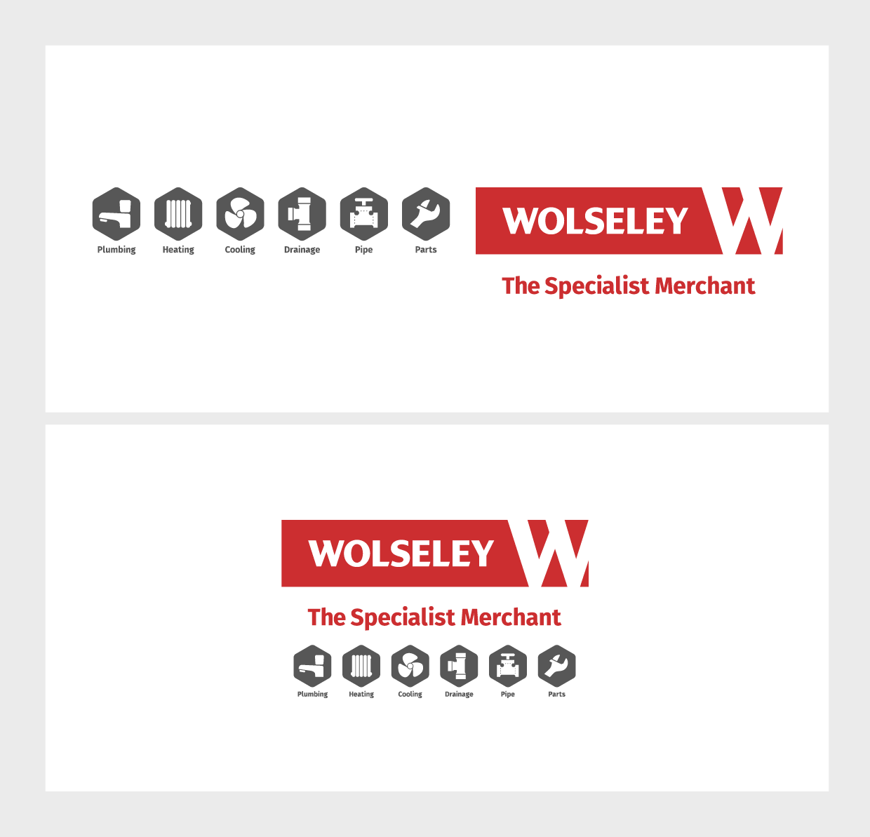
The Wolseley logo was introduced along with an overall look of a confident, dynamic and warm brand. Red is a colour that has always been associated with Wolseley but this time used with increased prominence within the brand expression. From a bold livery fleet, through to branch interiors where Wolseley Red was used as a ‘hot colour’ to help customers identify key branch functions intuitively.
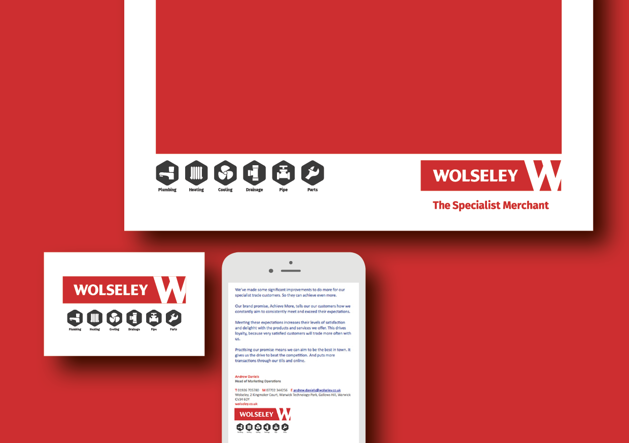
A bespoke system of icons and pictograms was developed using bold lines to add to the Wolseley visual language and to provide immediate recognition of their service and promotional offerings in store, online and across customer communications.
The brand was rolled out across Wolseley’s 500 UK branches, final mile fleet of 250 vehicles, staff uniform and its eCommerce platform. Stationery, email signatures, presentation templates and brand guidelines were also produced.
All work completed at The Team.
My role:
Branch format
Iconography and pictograms
Stationery and templates
Brand guidelines


